 ← Home
Identity concept · Art direction · Digital
SKECHERS
Reframing a global comfort brand around one clear idea: comfort should never stand still.
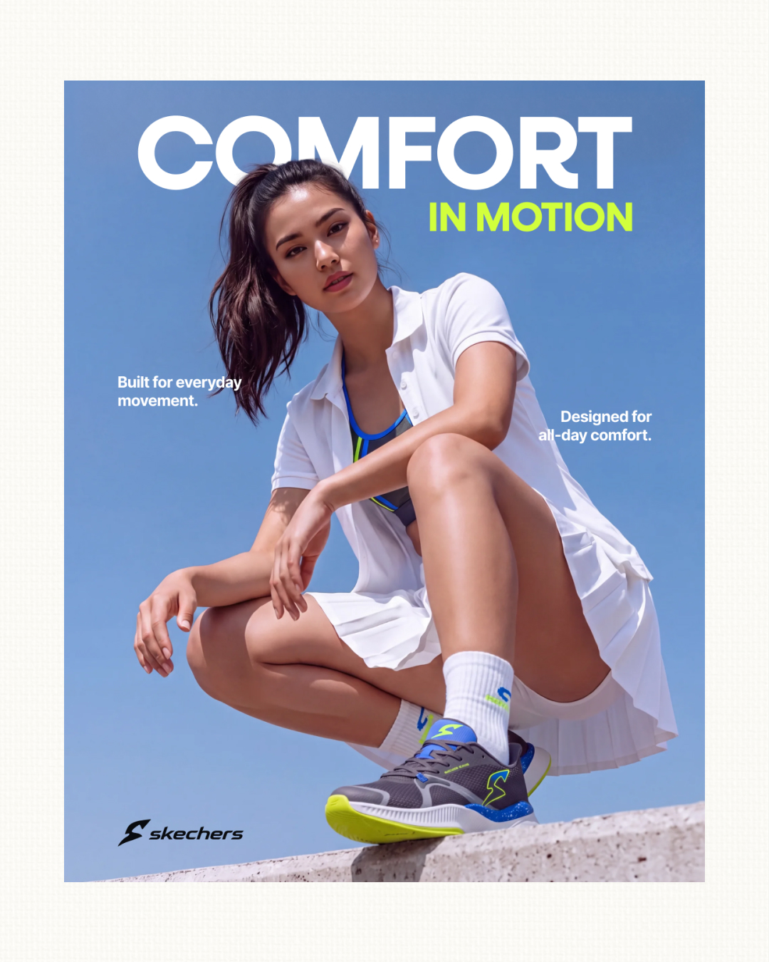 01 / HERO CAMPAIGN
( Overview )
COMFORT
IN MOTION.
Skechers already owned comfort. The opportunity was to give that promise a sharper visual language—one that could feel technical, energetic and relevant across product, campaign and digital.
- Client
- Skechers — concept
- Scope
- Identity · Campaign · Digital
- Year
- 2026
- Market
- Global
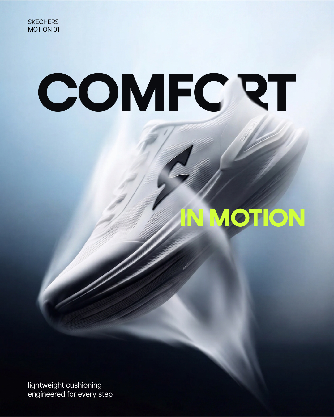
( 01 — The challenge )
ONE BRAND.
TOO MANY SIGNALS.
The existing identity had recognition, but its visual language shifted between products and platforms. We reduced the noise and built a system around speed, cushioning and effortless everyday movement.
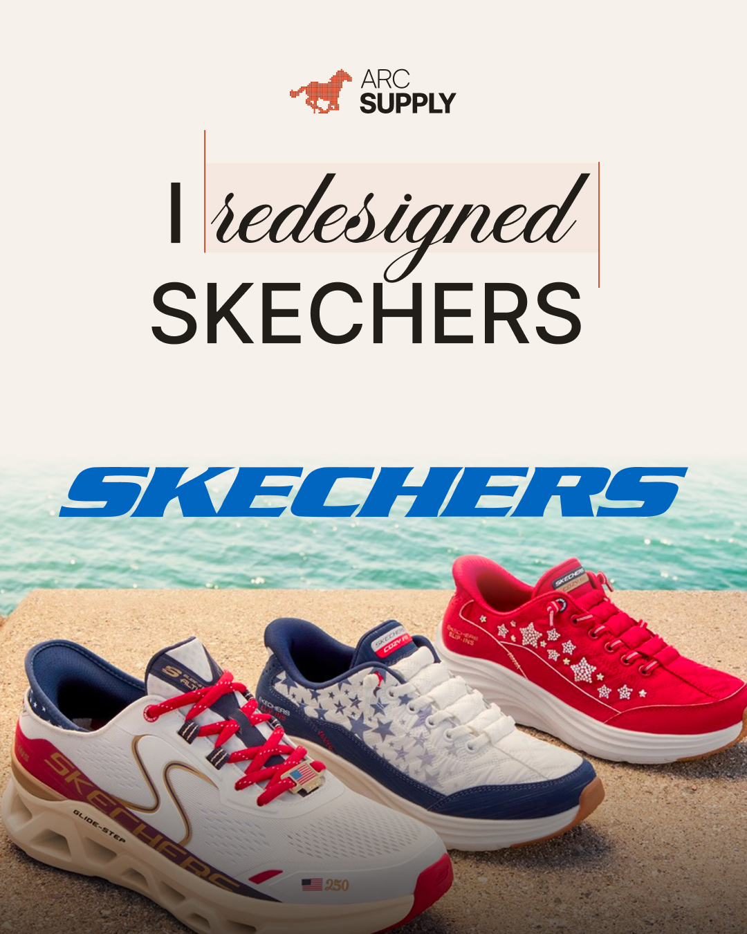
( 02 — Identity system )
A MARK
BUILT FORWARD.
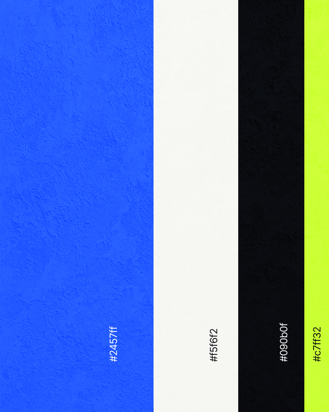
The evolved symbol holds the familiar “S” while introducing a more directional silhouette. A compressed wordmark and high-energy palette complete a system designed to move across every scale.
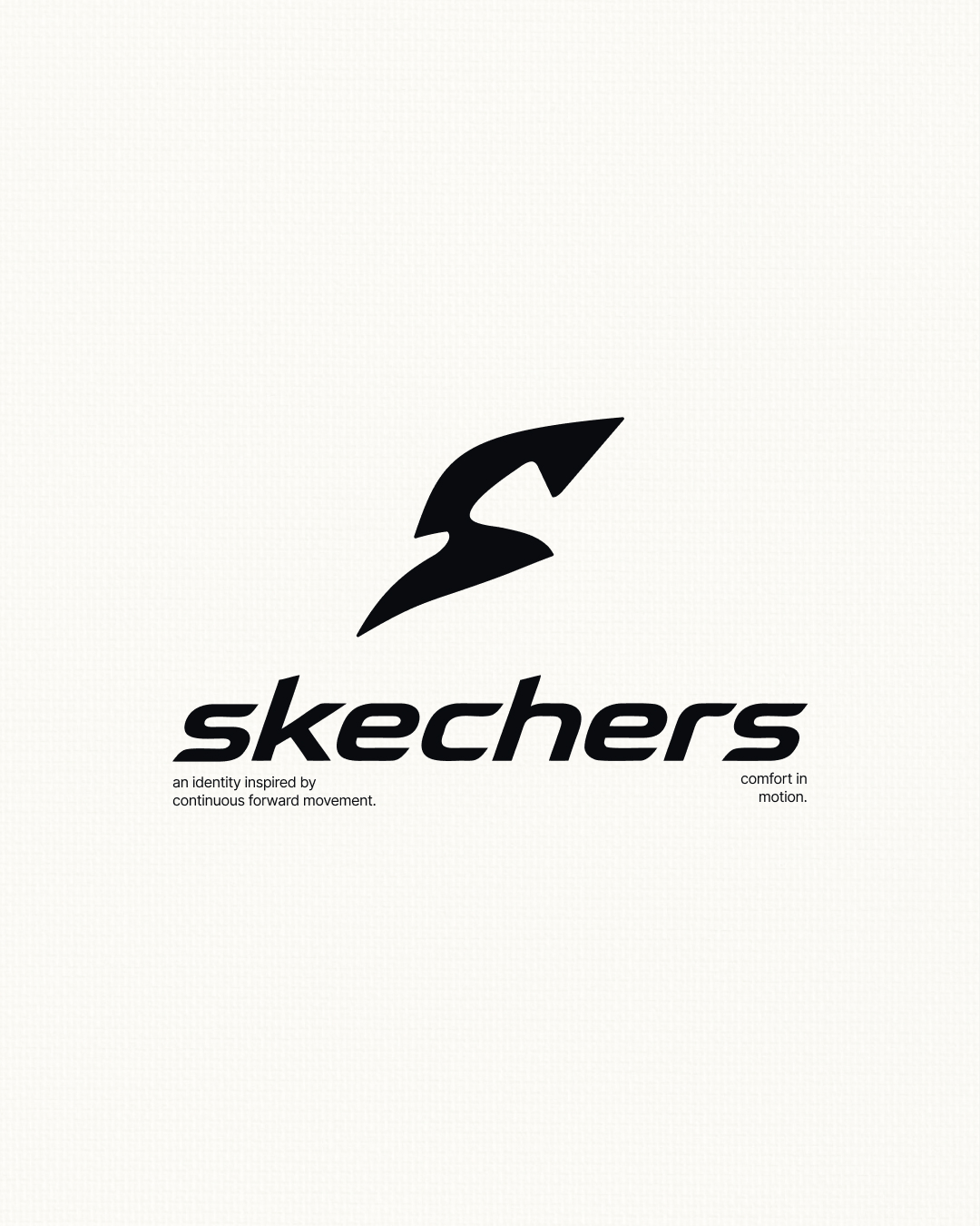
( 03 — Campaign system )
BUILT FOR
EVERY STEP.
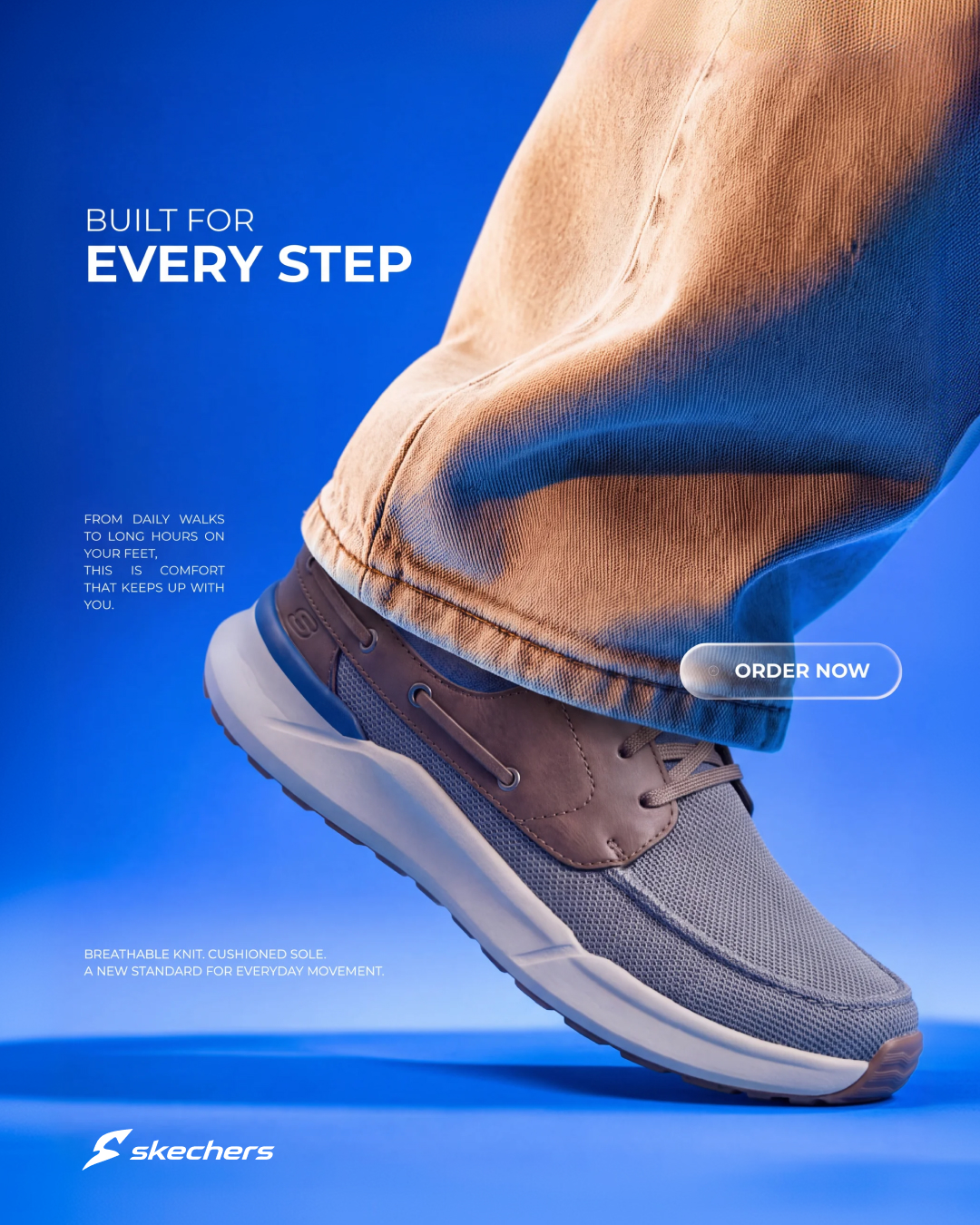
Product truth became campaign language: bold scale, low-angle motion, breathable space and a flexible message system for performance and lifestyle.
( 04 — Digital )
THE SYSTEM,
IN USE.
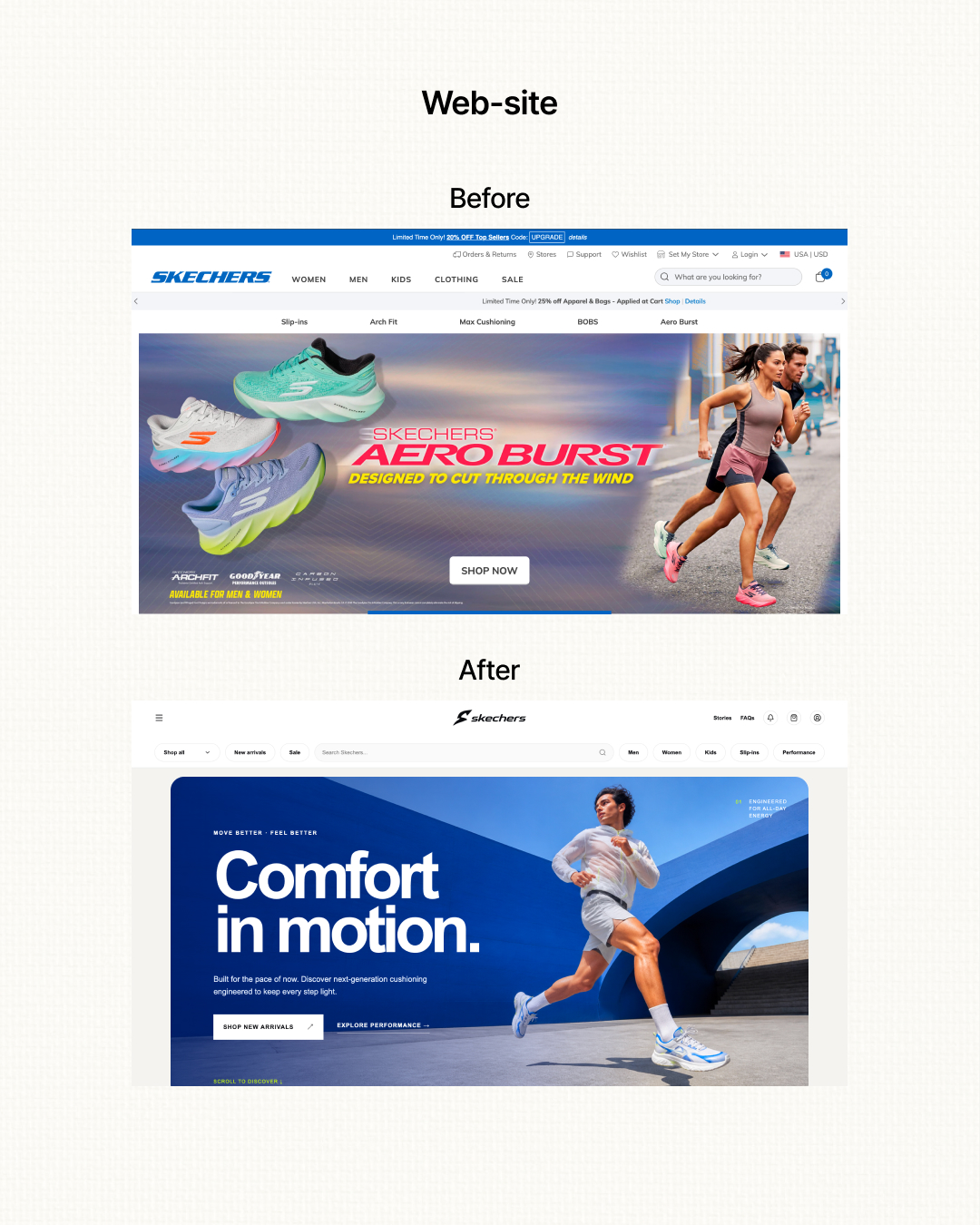
The homepage turns “Comfort in Motion” into a direct digital story: stronger hierarchy, clearer product entry points and one coherent visual world.
( Outcome )
FAMILIAR
WITHOUT STANDING STILL.
A concept identity that keeps Skechers recognisable while giving the brand a more focused, flexible and contemporary way to move.
Start a project ↗