 ← Home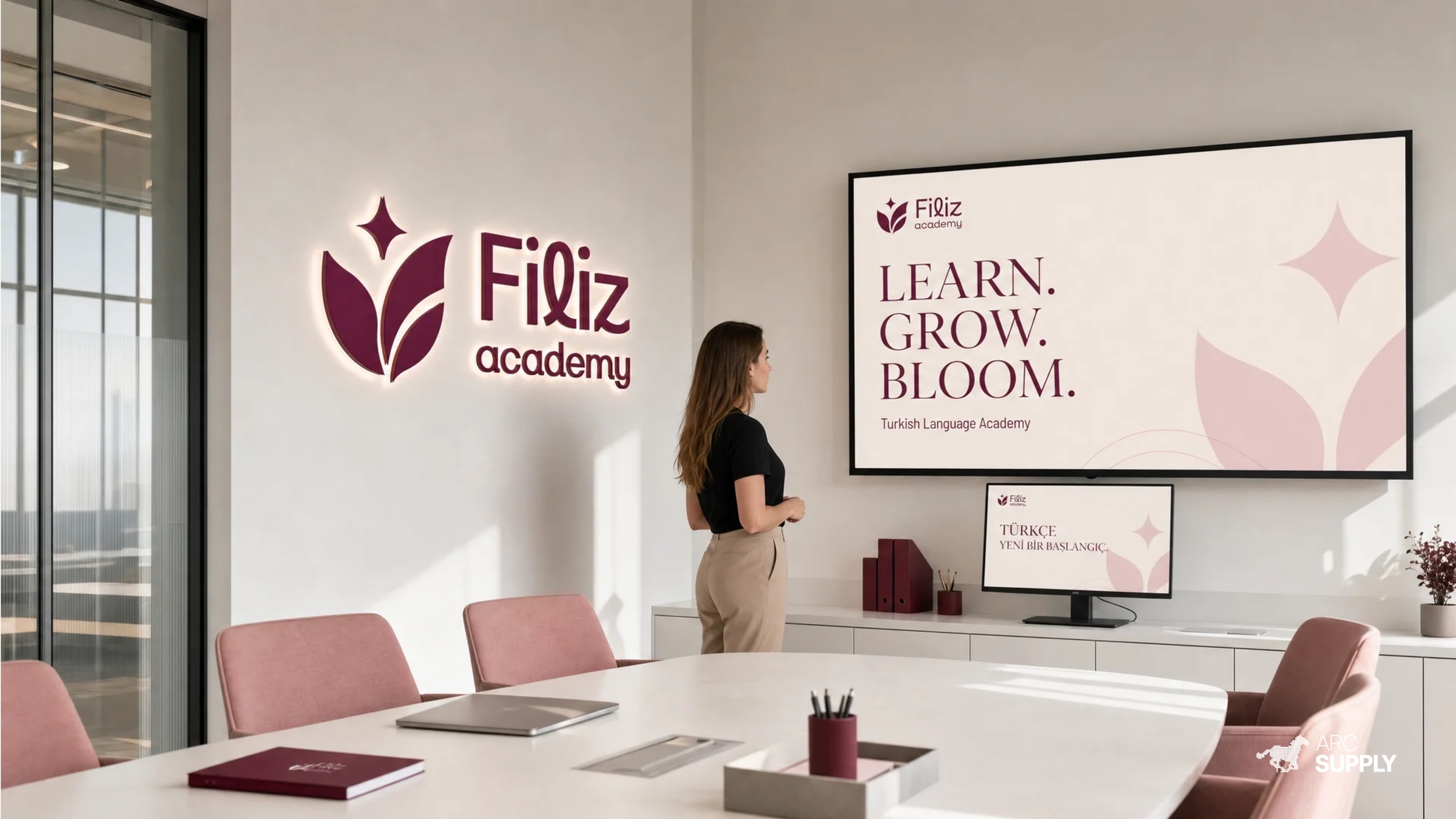
FILIZ
ACADEMY
A women-focused Turkish language academy built to make every new word feel like the beginning of something bigger.
( Overview )
A LANGUAGE FOR
GROWTH.
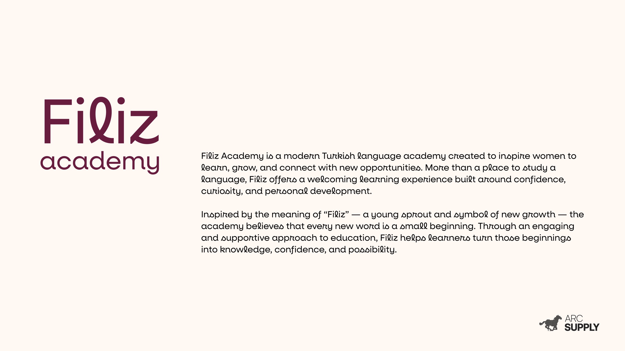
Filiz Academy is a welcoming learning centre where women learn Turkish, build confidence and connect with new possibilities. The identity turns the idea of a young sprout into a clear, warm and ambitious system.
- Client
- Filiz Academy
- Scope
- Strategy · Identity · Art direction · Digital
- Year
- 2025
- Market
- Education · Women
( 01 — Identity )
A SYMBOL FOR
NEW BEGINNINGS.
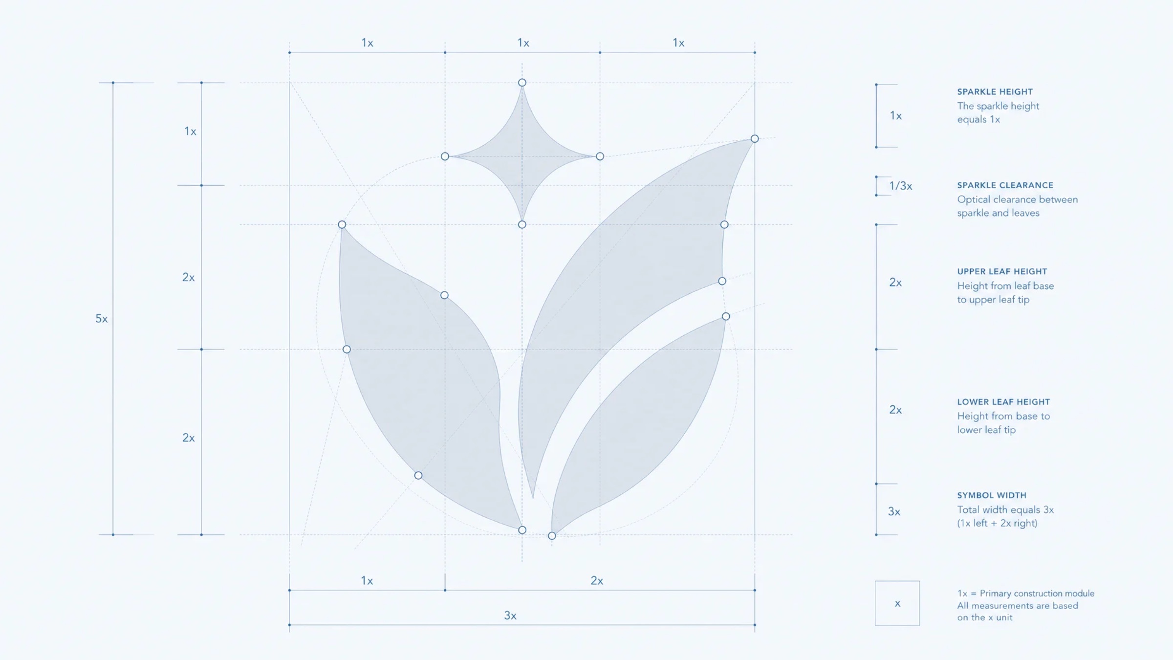
The symbol combines an opening book, a growing flower and a spark of discovery. Its upward movement captures the confidence that comes with every word learned.


( 02 — System )
CONFIDENCE
WITH WARMTH.
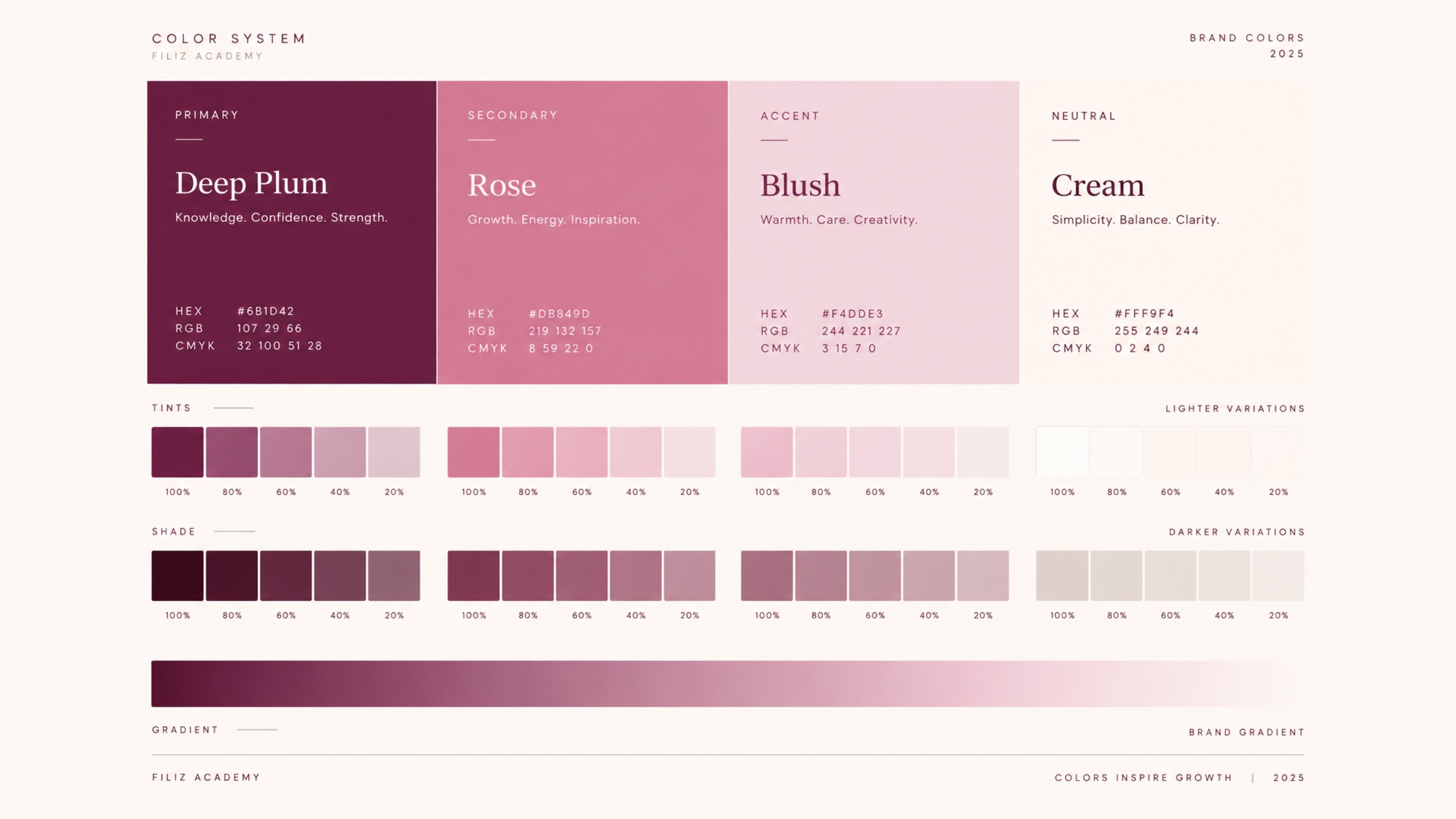
Deep plum carries knowledge and strength. Rose and blush soften the experience, while cream creates calm space for the brand to speak clearly.

( 03 — Environment )
A PLACE THAT FEELS
LIKE POSSIBILITY.
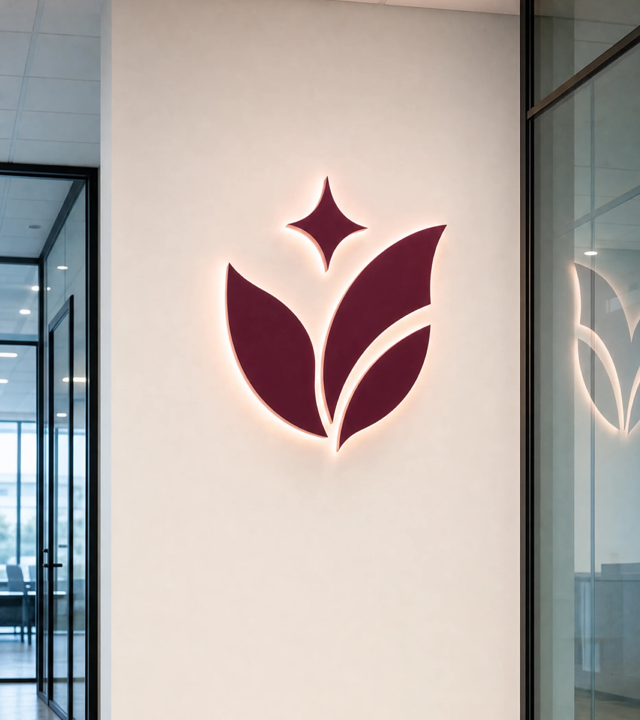
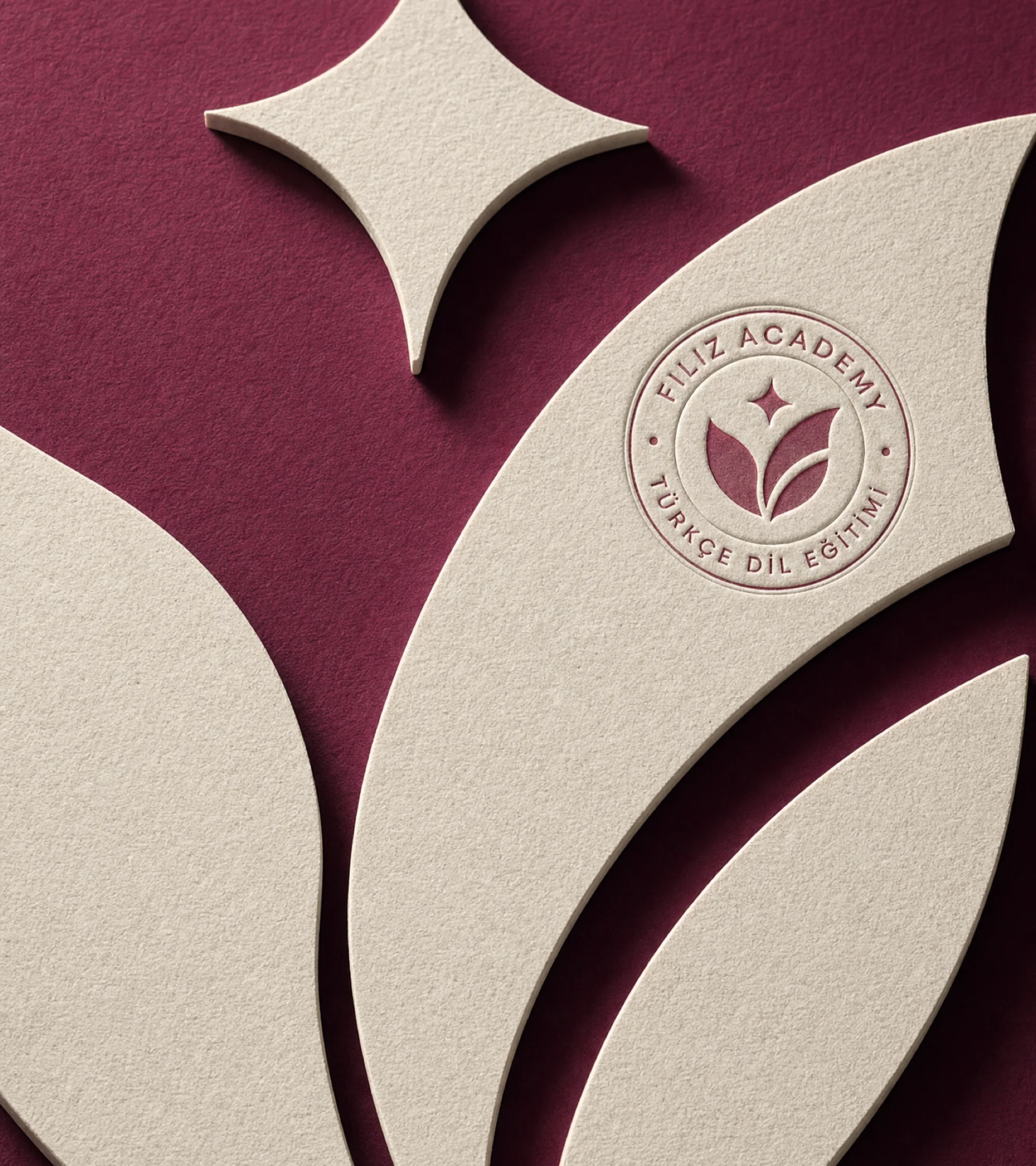
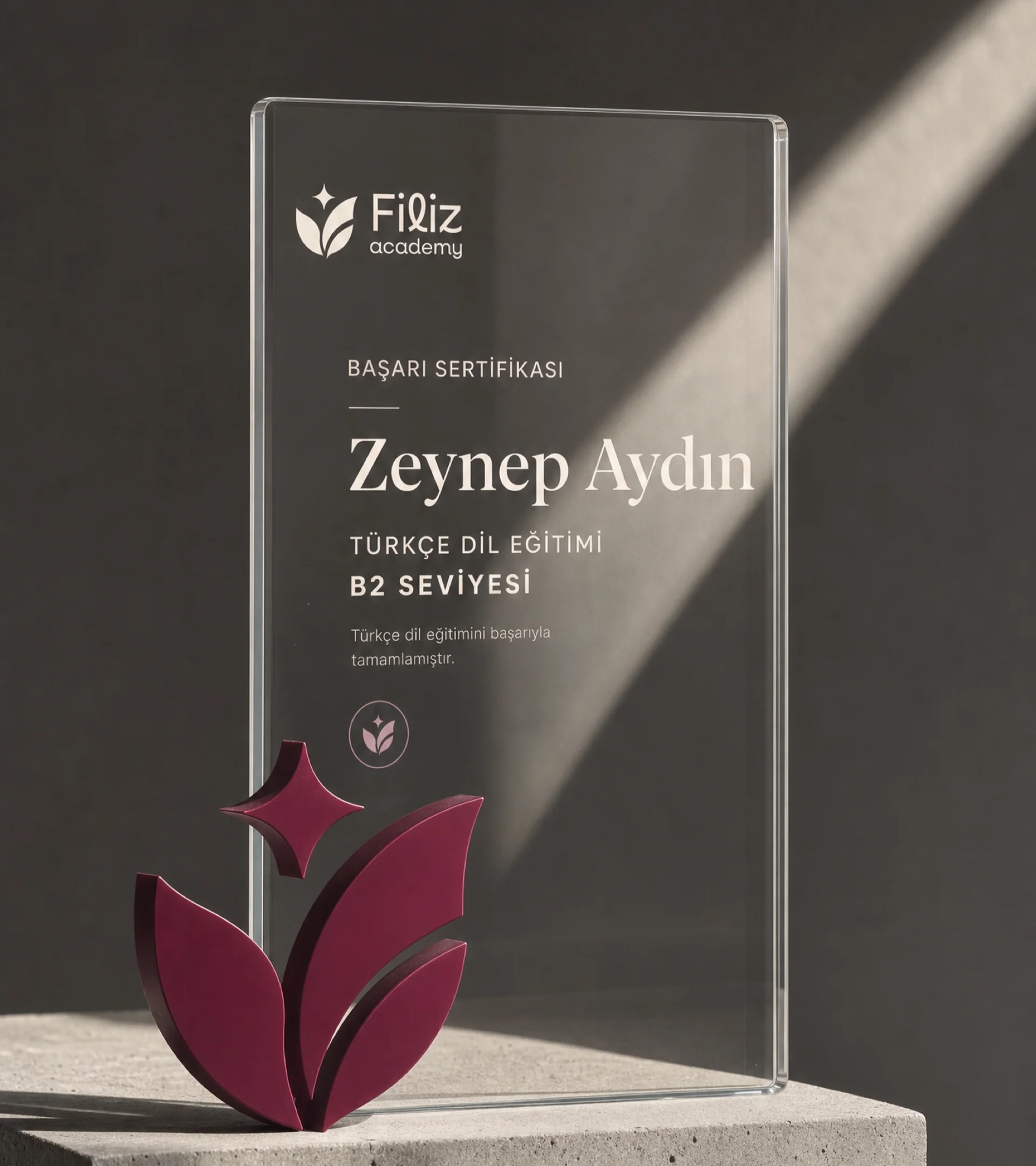
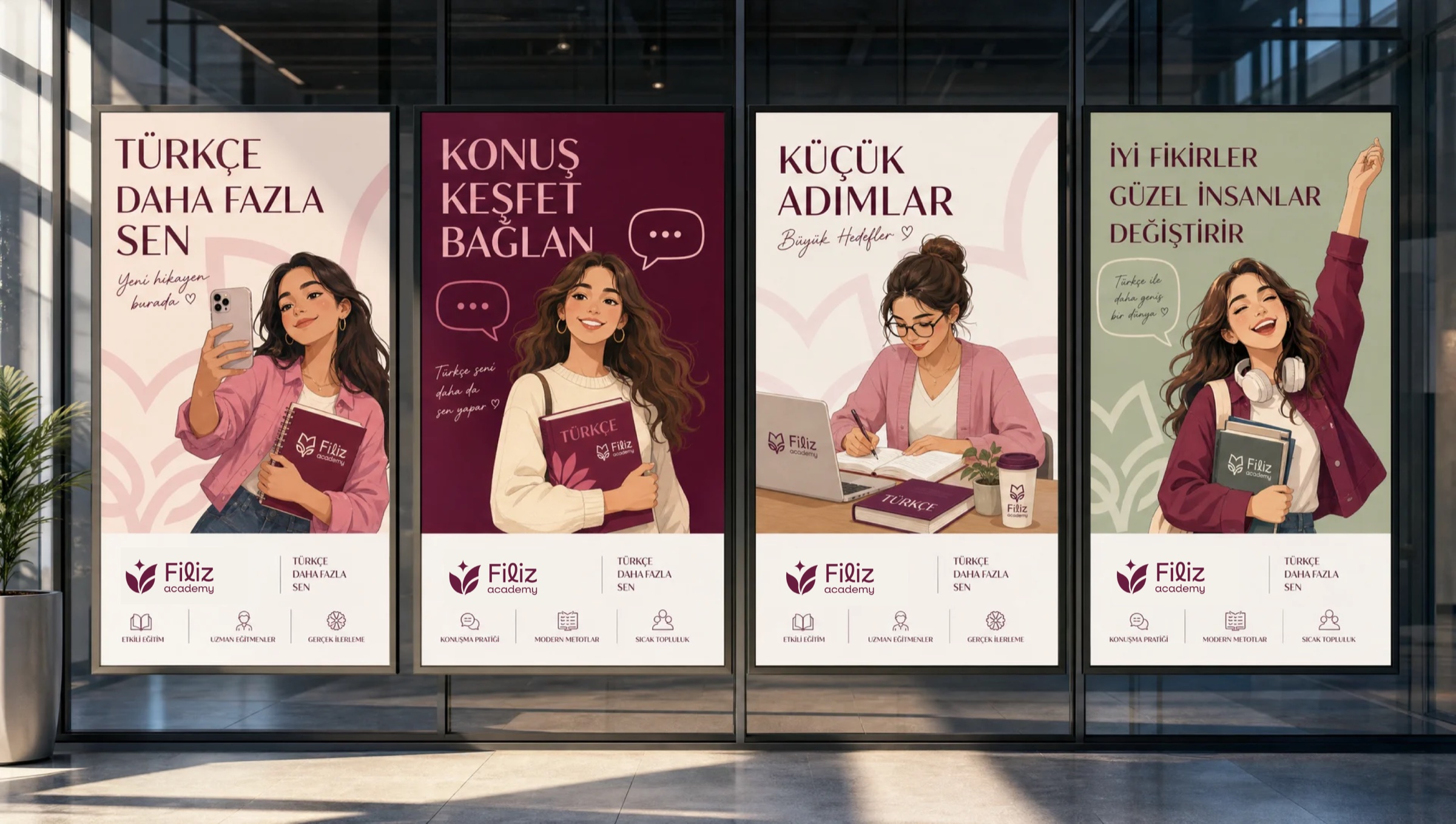
The identity moves naturally from the classroom wall to certificates and branded objects—giving the academy a recognisable, considered presence.
( 04 — Learning )
FROM FIRST WORD
TO REAL PROGRESS.
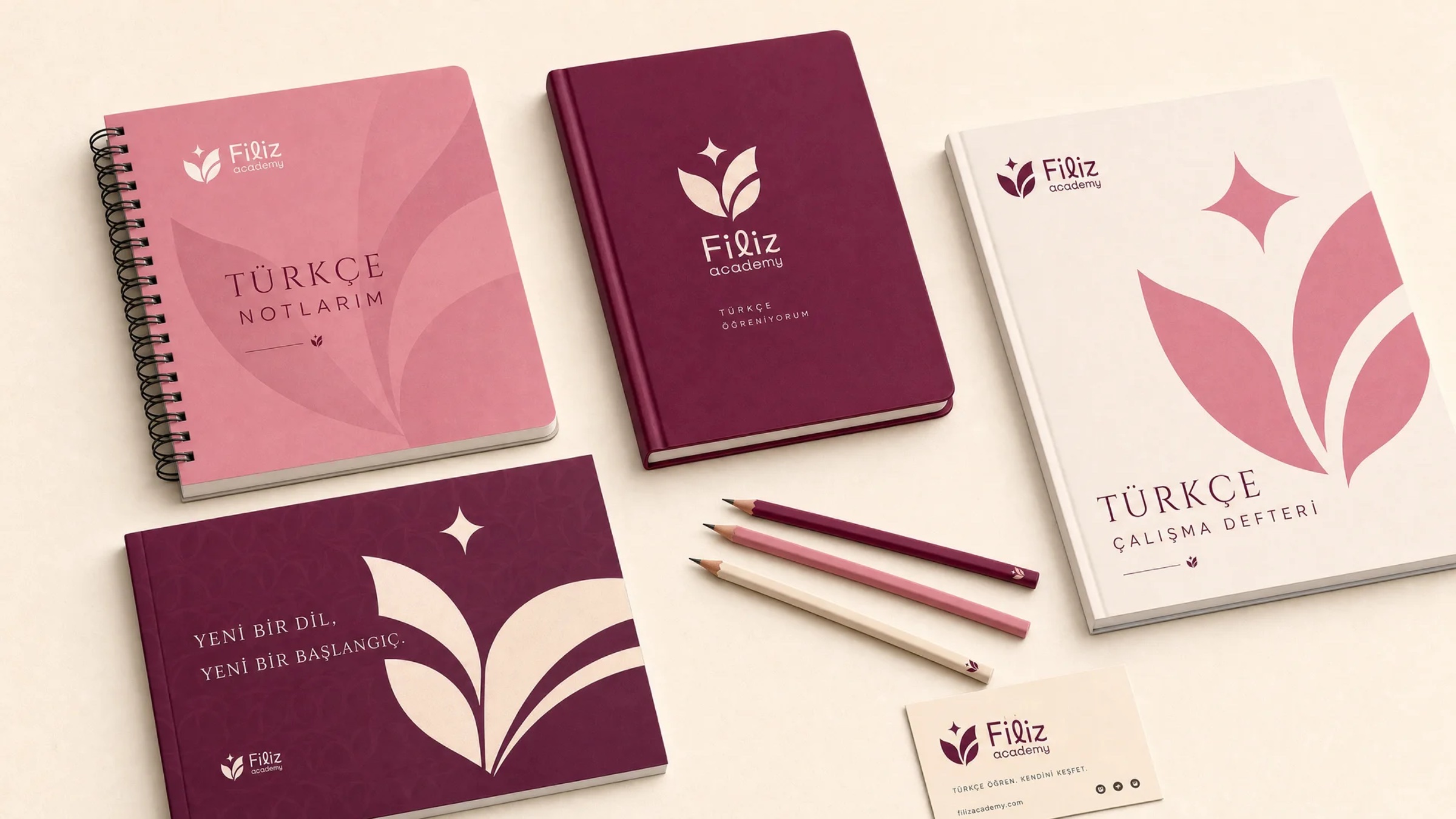
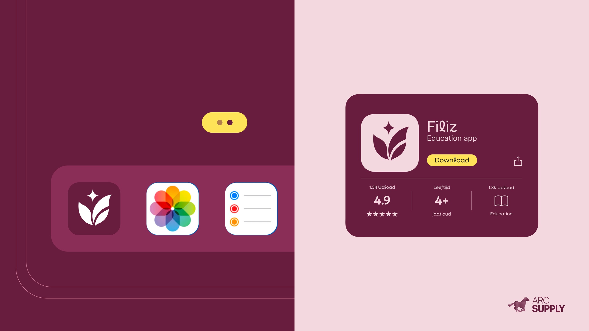
A flexible system brings the same confidence to workbooks, stationery, the education app and every milestone along the learning journey.

( 05 — Campaign )
TURKISH,
MADE PERSONAL.
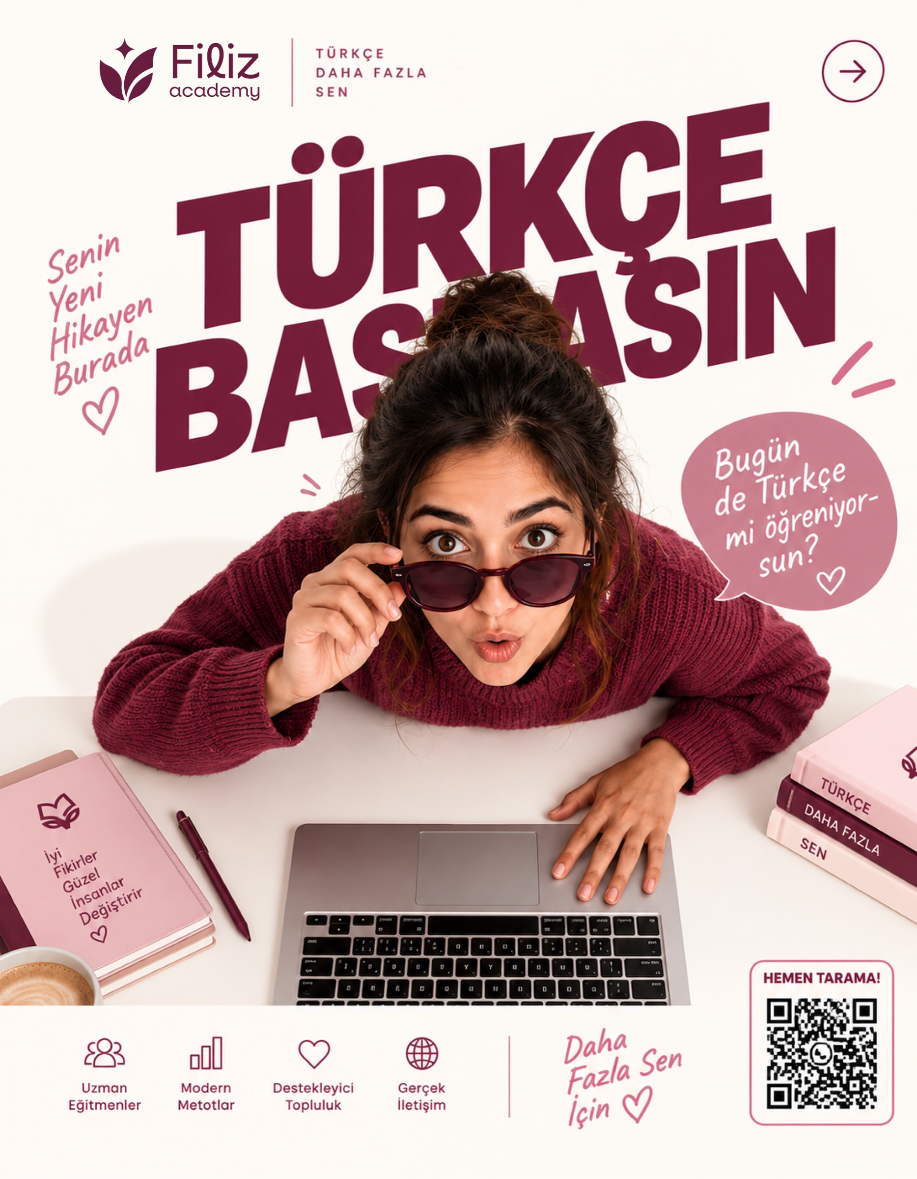
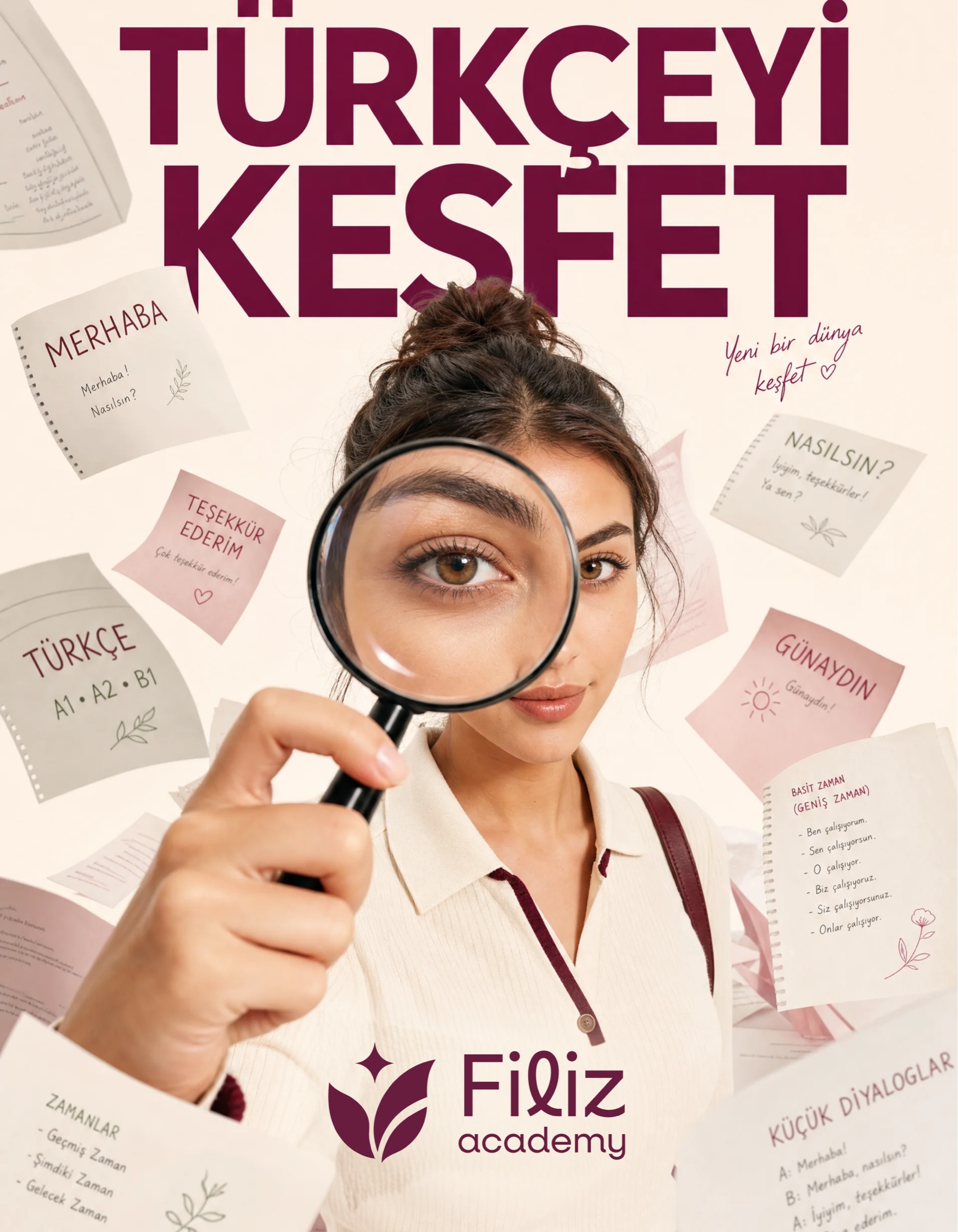
Bold typography, direct language and expressive portraits make learning feel social, modern and close to real life—not distant or academic.


( Outcome )
LEARN. GROW.
BLOOM.
A complete identity that gives Filiz Academy the warmth of a community and the confidence of a modern education brand.
Start a project↗