 ← Home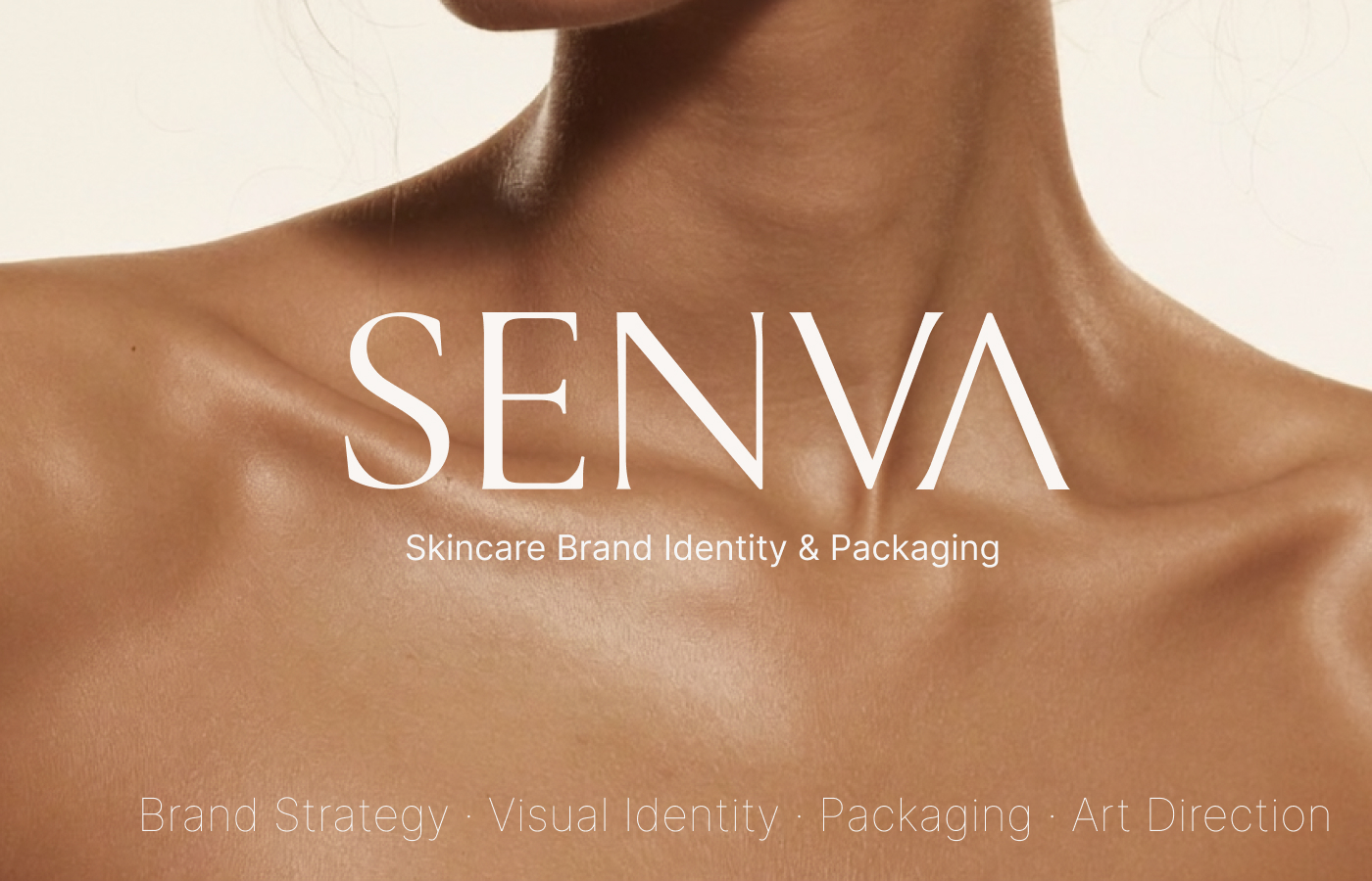
A skincare identity designed around quiet confidence, botanical intelligence and the rhythm of an everyday ritual.
( Overview )
CALM BY NATURE.
CLEAR BY DESIGN.
SENVA needed to feel considered without becoming clinical, and premium without losing warmth. We built a restrained identity where deep botanical green, soft neutrals and elegant typography turn skincare into a clear, tactile ritual.
- Client
- SENVA — concept
- Scope
- Strategy · Identity · Packaging
- Year
- 2026
- Market
- Beauty · Skincare
( 01 — Identity )
A WORDMARK
WITH RESTRAINT.
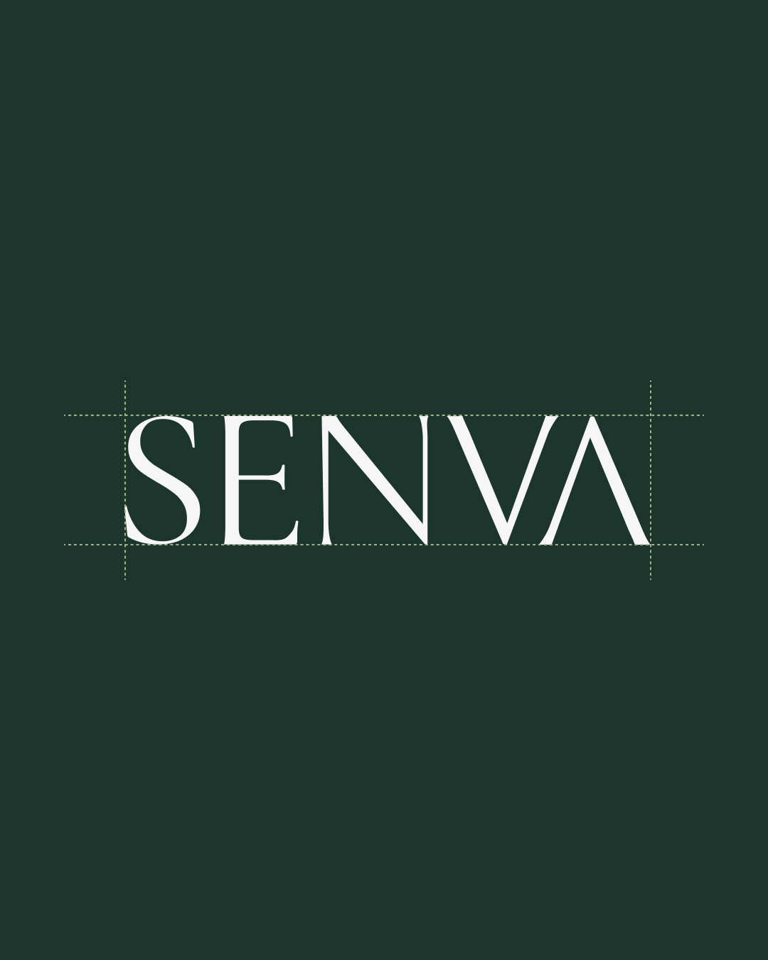
A high-contrast serif wordmark gives SENVA a refined, editorial voice. Its generous proportions and precise construction balance softness with authority.
( 02 — Packaging )
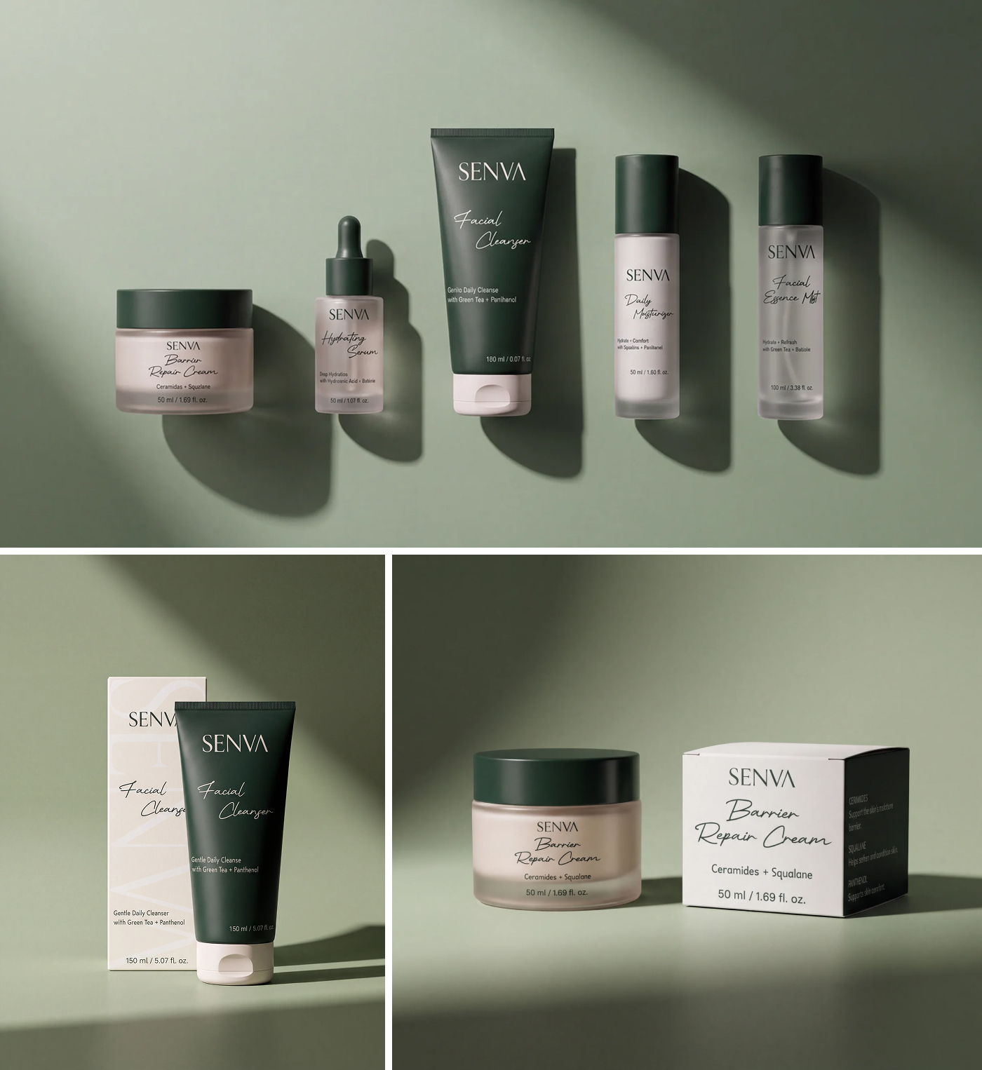
A SYSTEM FOR
DAILY RITUALS.
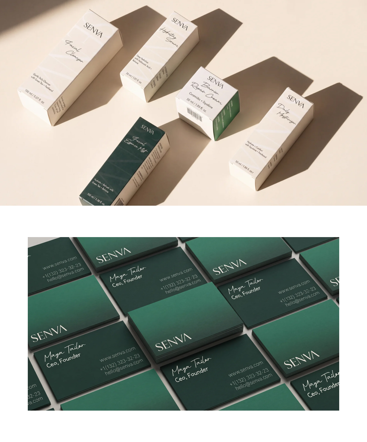
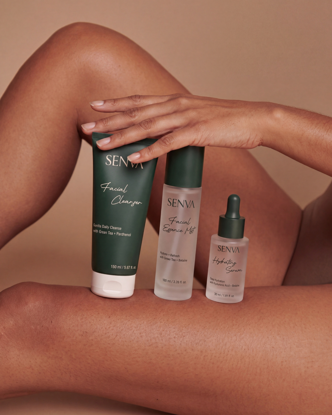
Every product follows one clear architecture. Forest green signals active care, warm ivory brings softness, and handwritten details add a human note across the range.
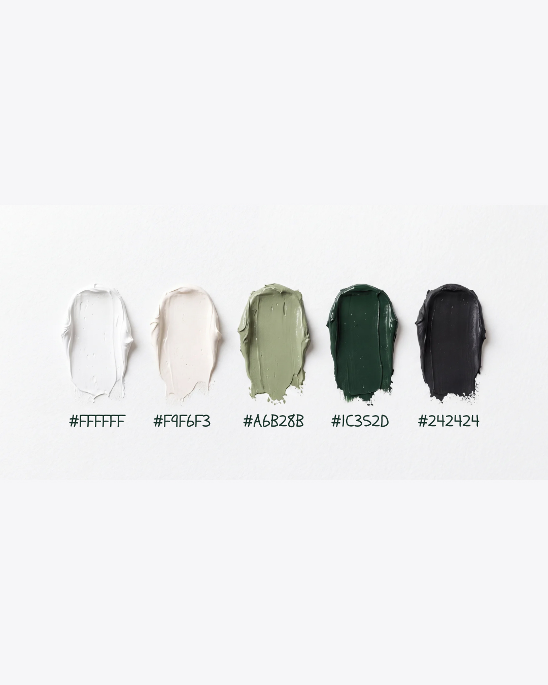
( Colour system )
BOTANICAL,
NOT DECORATIVE.
The palette moves from clean white and warm cream through sage and deep forest green to grounded charcoal.
( 03 — Digital )
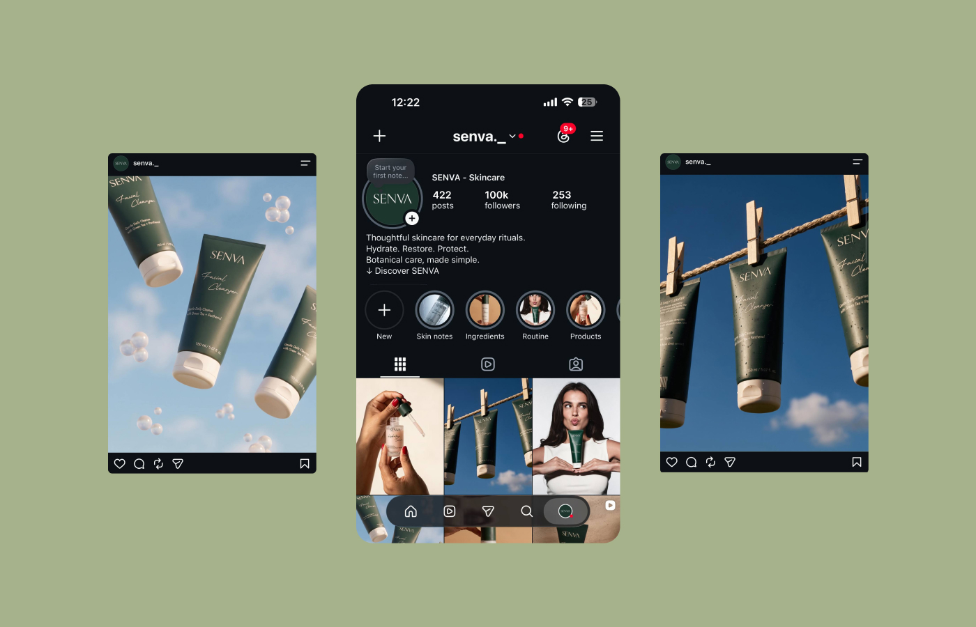
THE IDENTITY
IN MOTION.
A modular social system turns product education, rituals and campaign photography into one recognisable visual world.
( 04 — Art direction )
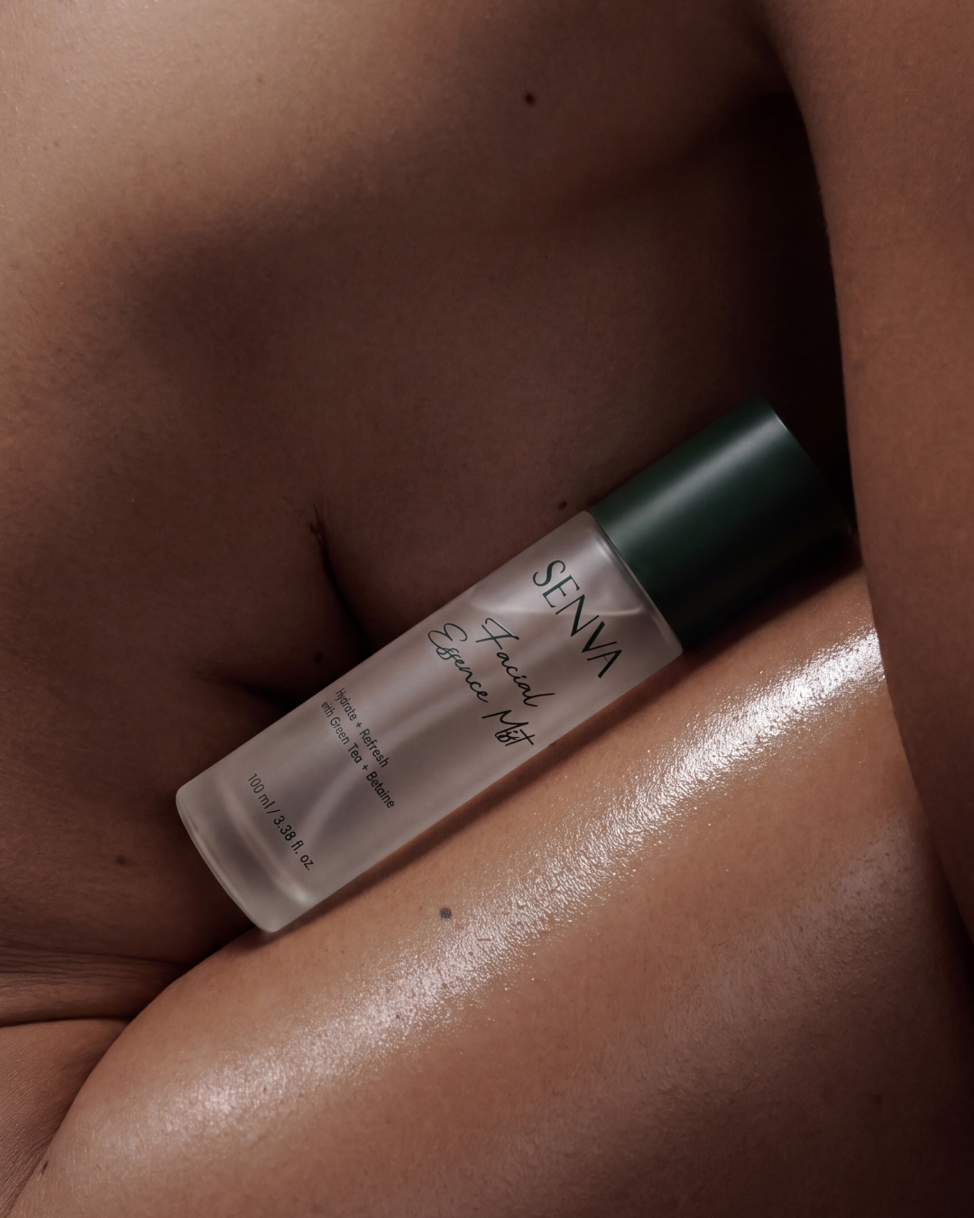
SKIN, PRODUCT
AND LIGHT.
Close crops, honest skin texture and directional light keep the campaign sensory and human while the product remains unmistakably central.
( Outcome )
SOFT PRESENCE.
STRONG RECALL.
A complete skincare identity that feels calm at first glance and distinctive at every touchpoint—from shelf to screen.
Start a project↗